Flashin’ on the 70s salutes the fabulous fashion revolutionary Elio Fiorucci with an interview from the archives

Elio Fiorucci: bringing the spirit of Carnaby Street to the world. Photograph: A Roveri (Archivio Mondadori)

Elio Fiorucci: bringing the spirit of Carnaby Street to the world. Photograph: A Roveri (Archivio Mondadori)

We were very sad to hear of the recent death of Elio Fiorucci, one of the most radical and influential designers of the 70s, who perfectly captured the decade’s spirit of diversity and self-expression in his string of shops from Milan to New York to London – fashion and lifestyle emporiums that doubled as destinations in which to see and be seen, hang out and party. Like the London stores he was inspired by – particularly Barbara Hulanicki’s Biba and Tommy Roberts’s Mr Freedom – Fiorucci’s fun, flashy, irreverent designs collaged pop culture iconography and cribbed from various decades, combining 40s glamour, 50s kitsch and 60s youthquake with keenly sourced inspirations from around the ever-shrinking globe, prompting the label’s biographer Eve Babitz to describe it as ‘the whole 20th century in one place’.

Another ad collages Fiorucci's pop culture pick 'n' mix: UFOs, disco, old Hollywood... Photograph copyright of Edwin Co Ltd

An advertising poster displays Fiorucci’s pop culture pick ‘n’ mix: UFOs, 50s kitsch, disco, old Hollywood… Photograph copyright of Edwin Co Ltd

And it was a place everyone wanted to be: famously Fiorucci’s New York store attracted everyone from Hollywood to bonafide royalty, rock stars, presidents’ wives, and the starry crowd who frequented the legendary nightclub Studio 54, not to mention the daring individuals in synch with the decade’s anything goes, do-your-own thing zeitgeist, which also drove the label’s creator.

A party at the New York store in the 70s - it was a magnet for the famous and fabulous, from Andy Warhol to cool club kids. Photo courtesy of Franco Marabelli

A party at the New York store in the 70s – it was a magnet for the famous and fabulous, from Andy Warhol and Debbie Harry to cool club kids. Photo courtesy of Franco Marabelli

When we were researching our book 70s Style & Design we were lucky enough to interview this fashion luminary about his work in the context of the decade’s key trends. Here it is…

We’ve read that you wanted to bring the spirit of Carnaby Street to Milan, and that you were influenced by Biba (as a lifestyle emporium) and Tommy Roberts’s fashion label Mr Freedom, whose pop sensibility and collaging of eras echoed that of Fiorucci’s designs. What drew you to London in the late 60s and how did it differ from Milan? Milan seems to have been very creative too, with designers such as Ettore Sottsass, Archizoom, etc.

During my first inspiring trip to London in 1964 I was struck by the radical changes in lifestyle and fashion trends. What I liked most was the Biba shop. I fell in love with its attention to detail; with the quality and honest price of every product – it was revolutionary! Also important were Carnaby Street, Ossie Clark and Zandra Rhodes.

In Milan, yes, we had Sottsass, Achille Castiglioni, Archizoom and Alessandro Mendini, who were making radical changes in the design world, but there wasn’t a fashion scene like there was in London.

A Carnaby Street inspired collage from Elio Fiorucci's book Liberi Tutti by Giannino Malossi

A Carnaby Street-inspired collage from Elio Fiorucci’s book Liberi Tutti by Giannino Malossi

One of our book’s key themes is the backlash against polite, pared-down modernism by the pop movement. By the 70s the reaction against modernism’s restrictive visual vocabulary had led to designs that were expressive, ironic, fun, and challenged traditional notions of ‘good’ taste – for example the designs of Mendini and Sottsass, Mr Freedom and, of course, Fiorucci. Were you reacting against consistent, conservative design?

Yes, pop culture has been fundamental in my life, because it rejected conservatism, and instinctively I rejected conservative Italian culture. The 70s saw a global liberation of aesthetics that challenged the norms of every previous model.

Nova magazine showcases the Mr Freedom look in 1970

Nova magazine showcases the Mr Freedom look in 1970

One challenge to conventional ideas of ‘good’ design during the 70s was a very knowing use of kitsch, marked by the publication of Gillo Dorfles’s book on the subject in the late 60s and borne out (for example) by the presence of a Kitsch room at Big Biba in the early 70s. Was this something that influenced you?

I consider Gillo Dorfles a real luminary. He had a huge influence on the perception of aesthetics in Italy and the rest of the world with his uncompromising vision.

Biba's Kitsch room, designed by Whitmore-Thomas. Photograph courtesy of Steve Thomas

Biba’s Kitsch room, designed by Whitmore-Thomas. Photograph courtesy of Steve Thomas

Our book also covers the cultural pluralism that emerged during the 70s, of which Fiorucci is a great example, taking inspiration from different decades, cultures and countries…

My role of global researcher – a proto ‘coolhunter’ – along with my shops in Galleria Passarella and Via Torino in Milan (where there was an area for cultural and musical performances), was a wonderful opportunity to present a mix of objects, music, food, perfumes, etc, from around the world.

The interior of Fiorucci's New York store in 1976

The interior of Fiorucci’s New York store in 1976

Would you say that people were beginning to demand the kind of thing that Fiorucci was offering? Were attitudes to design changing? We get the impression that the 70s were a decade when people began to express themselves more through their clothes and surroundings and individuality was cherished. Do you agree with this?

Yes, the 70s freed people from conventions in dress and lifestyle, giving them the confidence to create their own personal style. The Fiorucci shops coincided with this. It was a fortuitous coincidence, but not really chance. I was in touch with the decade’s noncomformist zeitgeist.

The New York store's glamorous staff showcase the label's diverse influences, from army surplus to 50s sci-fi

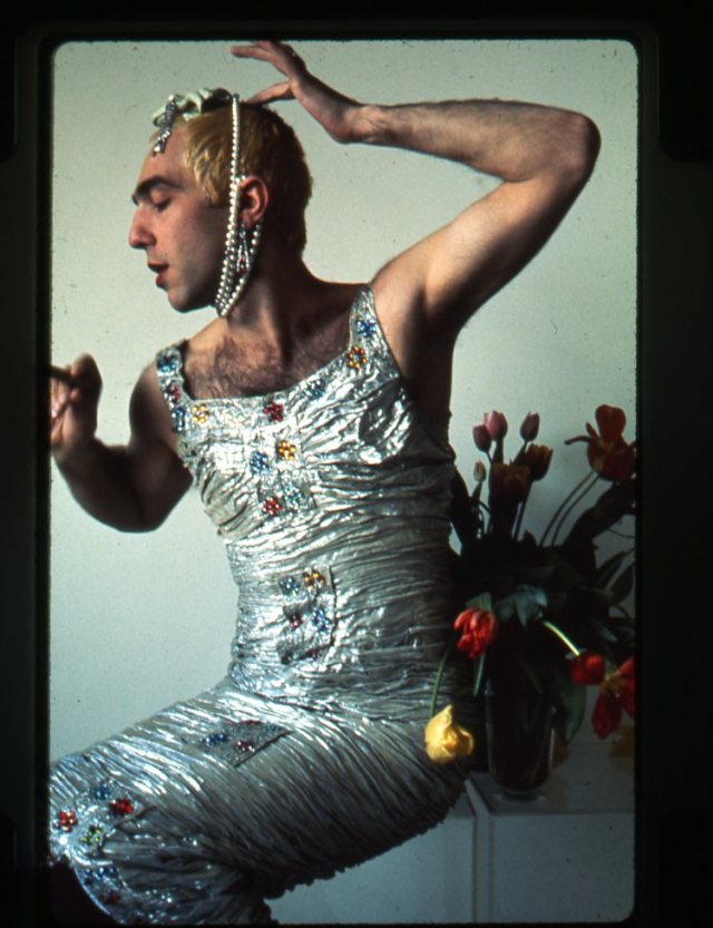
The New York store’s glamorous staff showcase the label’s diverse influences, from army surplus to 50s sci-fi. Photo courtesy of Raina Sachs

Our book will be covering the High-tech movement in interiors and the reinvention of utility wear and army surplus as fashion, something Fiorucci was an early adopter of. Tell us about this.

Yes Fiorucci reappropriated utility clothing, sportswear, military wear as fashion/street wear – a trend that continues today. The success of army surplus was exceptional: we sold about 3,000 pairs of American marine fatigue pants in one month, and these determined a trend in menswear for a long time.

You were also very ahead of your time in that your shops had High-tech interiors. What got you into the High-tech style generally? Were you influenced by designers such as Bruno Munari?

In my 40 years of activity in my shop in Galleria Passarella I experimented with every kind of furniture – from Amalia Del Ponte minimalism [she made geometric Plexiglass sculptures] to English Pop, to the work of graffiti artist Keith Haring, who transformed my shop in an artwork. Fiorucci’s High-tech period was quite short-lived because every two to three years I felt the need to change the shop’s style.

The window of Fiorucci's New York store, designed by Kit Grover circa 1978, reflects the era's high-tech trend. Photograph courtesy of Kit Grover

The window of Fiorucci’s New York store, designed by Kit Grover circa 1978, reflects the era’s High-tech trend. Photo courtesy of Kit Grover

Similarly, in a fashion context, you took industrial items like toolboxes and safety goggles and reinvented them as handbags and sunglasses. Was this related to your interest in High-tech and its placing of industrial objects in a domestic or non-industrial context?

I was immersed in a revolutionary culture in which conventions were called into question: why couldn’t a jute sack normally used for onions also be a tote bag? Why couldn’t a material like polythene be used for sandals? Why couldn’t the American hydraulics bag, carpenter’s belt and work shoes be part of a comfortable, functional fashionable wardrobe, just as jeans had been?

An advert for Fiorucci's Safety Jeans featuring a pair of original painter's overalls from the 20s in an homage to the utility clothing that inspired the label

An advert for Fiorucci’s Safety Jeans featuring a pair of original painter’s overalls from the 1920s in an homage to utility clothing, one of the many inspirations of the label. From Fiorucci The Book by Eve Babitz

Your collaging of eras and cultural references has led some to describe you as a postmodernist. Do you agree with this?

I don’t feel I belong to any movement in particular. I had the luck to live during a very interesting period of the 20th century, after a devastating war when there was the need to rebuild a new world, new values and a new life philosophy.

A 70s publicity poster chimes with the decade's nascent postmodernism. Copyright: Edwin Co Ltd

A 70s publicity poster chimes with the decade’s nascent postmodernism. Copyright: Edwin Co Ltd

Vivienne Westwood and Malcolm McLaren had a similar approach to you, playing with a range of stylistic vocabularies – from 50s revivalism to fetish gear as street wear – via their succession of shops: Let it Rock, Sex, Seditionaries, etc. Did they make an impression on you? We know she is a fan of yours.

I consider Vivienne Westwood a great artist and she was a great teacher to me. She appreciated my vision of change.

Sexiness is another of Fiorucci’s defining qualities. Was this influenced by the more libertarian attitudes that were emerging in the late 60s?

Eroticism is one of the most repressed drives in our culture. Free love, as an act of communion, is desirable. I think that with the end of fear love can begin, which will be joyful for all humanity.

Fiorucci's saucy monokini. From Fiorucci the Book by Eve Babitz

Fiorucci’s saucy monokini. From Fiorucci the Book by Eve Babitz

What was the inspiration behind Fiorucci’s plastic clothing and accessories? Was this a nod to the fun, throwaway fashion of the pop 60s?

Plastic is one of the most important inventions for humanity. It totally changed our way of life. It is beautiful, tactile, useful.

A pair of platforms piles on the pop culture references, from Carmen Miranda's 40s kitsch to 30s Ferragamo and 70s glam, all in glorious plastic

A pair of platforms piles on the pop culture references, from Carmen Miranda’s 40s kitsch to 30s Ferragamo and 70s glam, all in glorious plastic

Eve Babitz’s Fiorucci book mentions that Andrea Branzi and Ettore Sottsass collaborated with the label – it has a picture of an Alfa Romeo Giulietta that they redesigned for you, for example. Could you tell us more about your collaborations with them?

The Alfa Romeo Giulietta was redesigned by Ettore and Andrea. Unfortunately it was so innovative that the parent company, frightened, didn’t put it in production. Ettore Sottsass, Andrea Branzi and Franco Marabelli designed my shop on 59th street in New York.

The Fiorucci-designed Alpha Romeo Giulietta. From Fiorucci The Book by Eve Babitz

The Fiorucci-designed Alpha Romeo Giulietta. From Fiorucci The Book by Eve Babitz

We know that Fiorucci’s New York store was one of the places to go, along with Studio 54. What made Fiorucci so irresistible to people like Andy Warhol and the Studio 54 crowd?

The opening of the New York Fiorucci shop and, one year later, Studio 54 happened during a very special period. After London, New York was becoming the capital of the lifestyle revolution. Free-thinking people were looking for a place to experiment and New York was a magnet. It was no accident that Studio 54 – emblem par excellence of the disco phenomenon – opened in the heart of Manhattan.

Andy Warhol and Brooke Shields in the Fiorucci store, NY (Franco Marabelli)

Andy Warhol and Brooke Shields at the New York store

Debbie Harry in Fiorucci and high jinks at the New York store. Photograph courtesy of Raina Sachs

Debbie Harry in Fiorucci and high jinks at the New York store. Photo courtesy of Raina Sachs

In terms of Fiorucci’s fabulous graphics, were you and Franco Marabelli aware of UK graphic designers such as Barney Bubbles, Mike Haggerty and George Hardie? And the work of West Coast graphic designer April Greiman?

Yes, we knew of them but we didn’t delve deep. Our research spectrum was less specific, more instinctive. We visited the whole world, picking up antique/modern/ethnic objects. There were no rules, only, ‘Do we like it or not?’ Maybe this was the secret of Fiorucci’s success…

By the end of the 70s there were 3,000 international outlets selling Fiorucci. This is one of the many stickers produced for authorized vendors.

By the end of the 70s there were 3,000 international outlets selling Fiorucci. This is one of the many stickers produced for authorized vendors

Posted in 70s celebrities, Art, Fashion, New York, Uncategorized | Tagged , , , , , , , , , , , , , , , , , , , | 6 Comments

Hold on to your lapels! The 70s sashay back (again) for spring summer 2015 – and beyond…

Fashion, as we know, goes in cycles with the past routinely revisited for inspiration, and this spring/summer, there’s no escaping the fact that designers have descended on our favourite decade – the dizzyingly diverse 1970s.

Many of the key looks from those years – which correspond to several core themes of our book, 70s Style & Design – loomed large on the catwalks: pop cartoon colours, big buttons and huge spoon-shaped collars at Prada and Miu Miu; romantic hippie-meets-Victoriana get-ups in voiles and broderie anglaise at Chloe and Dior; denim and khaki utility kit at Ralph Lauren and Marc Jacobs; glam rock-inflected, David Bowie-esque ensembles at Saint Laurent; boho deluxe, 70s-hippie-trail dresses at Etro and Pucci – the latter surely inspired by the queen of the floaty gypsy frock Thea Porter, whose work is the subject of a timely exhibition at London’s Fashion and Textiles Museum.

Here’s a compare and contrast of some of 2015’s major trends and their 70s looky likeys…

Boho deluxe

Boho opulence by Thea Porter

Boho opulence by Thea Porter

Zandra Rhodes Ophelia

Zandra Rhodes’s take on doomed romantic heroine Ophelia, photographed by Joe Gaffney

chloe

Chloe hits the hippie trail in Afghanistan, 1970

Utility

Charlie promotes the dude outdoorsy look

An ad for Charlie’s cosmetics line chimes with the 70s outdoorsy look

Oliviero Toscani joins the army for L'Uomo Vogue

Oliviero Toscani joins the army for L’Uomo Vogue

Hermes mixes denim and khakis with a classic silk scarf - very Gucci S/S 2015

Hermes mixes denim and khakis with a classic silk scarf – very Gucci S/S 2015

Patchwork

patchwork bed

Living the patchwork lifestyle, from 70s style bible Native Funk & Flash

patchwork levis

70s patchwork Levi’s as seen in Peter Beagle’s book American Denim

French Elle cover

Jean-Charles de Castelbajac’s patchwork blanket coat

Rustic romance

PICNIC AT HANGING ROCK

A still from Peter Weir’s 1975 film Picnic at Hanging Rock

Picture 006

Laura Ashley’s prairie girl chic

crash jeans ad

Happy homesteaders in an ad for Italian jeans label Crash

Trashy glam

The Moodies

Early 70s performance artists the Moodies

Pop

Harri Peccinotti pop fashion

A 19 magazine fashion story by Harri Peccinotti, 1971

Disco

Swanky Modes show

A late 70s Swanky Modes fashion show featuring singer and actress Eve Ferret, by Niall McInerney

Yes, 70s fashion rules right now, but while it’s being touted in the media as the latest thing, we’re of the opinion that this is just a spike in a trend that’s been hiding in plain sight for years. Think about all those fashion staples we take for granted ­– army surplus, wedge-heels, shaggy fur jackets, satchels, Le Style Anglais heritage looks, knee-length boots, platforms, flares, culottes – even the ubiquitous skinny jeans. And the decade is perennially present in the collections of designers such as APC and Isabel Marant and the rock chick wardrobe of Kate Moss.

What’s more, the decade continues to captivate beyond planet fashion: a re-edited version of the 70s-set 1998 movie 54 showed at this year’s Berlin Film Festival; the super-popular Mad Men TV series is now entering that decade (its trailer soundtracked by Diana Ross’s smooch-tastic Love Hangover); Martin Scorsese and Terence Winter are cooking up a 70s drama produced by Mick Jagger, and Baz Luhrmann is working on a series for Netflix based in 70s New York called The Get Down (which traces the evolution of disco, punk and hip-hop).

Perhaps the latter will reignite interest in the second half of the decade, which was conspicuous by its absence on the spring/summer catwalks – although Isabel Marant did produce a skintight asymmetric disco shift that wouldn’t have looked out of place in 1979. Given the groundbreaking nature of punk and new-wave style alone, it’s curious that more designers haven’t mined this part of the decade – but perhaps it will form the next chapter of fashion’s fascination with the 70s.

Meanwhile the early 70s influence is going nowhere, judging by the autumn/winter collections of Chloe, Gucci, Burberry – even Topman, which nodded to the ultra-pop style of Mr Freedom and those tartan teenyboppers the Bay City Rollers. Here’s hoping the Sex Pistols will play muse next…

Never can say goodbye: the 70s are sticking around for A/W 2015

Posted in 70s celebrities, Fashion | Tagged , , , , , , | Leave a comment

Guy Bourdin’s sassy 70s surreo-pop snaps stride into view

Charles Jourdan, Spring 1979 © The Guy Bourdin Estate, 2014/Courtesy A+C

Charles Jourdan, Spring 1979 © The Guy Bourdin Estate, 2014/Courtesy A+C

While choosing images for our book 70s Style & Design, there was one photographer whose work we had to feature — Guy Bourdin, currently the subject of an exhibition at London’s Somerset House called Guy Bourdin: Image-Maker. Why? Well, Bourdin, who had a great eye for composition and a rather peculiar yet gorgeous colour palette, dreamt up some of the decade’s most glam, arresting fashion images. We also wanted to include one of these because they chimed perfectly with some of our book’s main themes — pop style, avant-garde fashion and a 70s infatuation with Surrealism.

Vogue Paris, May 1970 © The Guy Bourdin Estate, 2014/Courtesy A+C

Vogue Paris, May 1970 © The Guy Bourdin Estate, 2014/Courtesy A+C

Indeed, the decade was awash with Surrealist imagery but Bourdin wasn’t jumping on the bandwagon: born Guy Louis Banarès in Paris in 1928, Bourdin got hooked on Surrealism from an early age and became a protégé of Man Ray, whom he met in 1950. His first fashion shots were published in 1955 by French Vogue, which also featured the photographs of his contemporary, Helmut Newton, another fervent admirer of Surrealism. From 1967 to 1981, Bourdin photographed shoe designer Charles Jourdan’s ad campaigns, their unique style founded on surreal compositions and saturated colours.

In the early 70s Bourdin's work prefigured the late 70s hard-gloss look, which was still going strong in the early 80s. This image (note the rose madder blusher) epitomises it perfectly! Pentax calendar, 1980 © The Guy Bourdin Estate, 2014/Courtesy A+C

In the early 70s Bourdin’s work prefigured the late 70s hard-gloss look, which was still going strong in the early 80s. This image (note the rose madder blusher) epitomises it perfectly! Pentax calendar, 1980 © The Guy Bourdin Estate, 2014/Courtesy A+C

Charles Jourdan, Spring 1976 © The Guy Bourdin Estate, 2014/Courtesy A+C

Charles Jourdan, Spring 1976 © The Guy Bourdin Estate, 2014/Courtesy A+C

By the 70s, as a fully fledged photographer, Bourdin was at the vanguard of a new trend that saw Surrealist influences — notably Ray, Salvador Dalí and René Magritte — collide with pop style, itself mainly inspired by Tom Wesselmann, Claes Oldenburg and Roy Lichtenstein. This resulted in a surreo-pop hybrid that informed all areas of culture and design, from fashion and furniture to illustration and advertising. Since both the pop and Surrealist movements rejected rationality outright, this wasn’t such a surprising union. Hinting, like much sinister Surrealist art, at violence yet vibrantly pop in its predilection for hot pink, emerald green and turquoise, Bourdin’s work embodied this crossover. His hard-edged, super-stylised colour photographs also prefigured the late 70s vogue for vampish, garish make-up typically teamed with body-con clothing and dagger-sharp disco heels — a look we’ve nicknamed ‘hard gloss’!

Charles Jourdan, Autumn 1970 © The Guy Bourdin Estate, 2014/Courtesy A+C

Charles Jourdan, Autumn 1970 © The Guy Bourdin Estate, 2014/Courtesy A+C

Although we’d researched Bourdin’s images in books and online, the Somerset House show — which features more than 100 colour images, Polaroids and Super-8 films, produced from 1955 to 1987 — shed a lot more light on this 70s snapper. To our surprise, we discovered that Bourdin travelled around Britain with his partner and son in a black Cadillac — well, there had to be a glam element! — photographing his ‘Walking Legs’ series for Charles Jourdan’s 1979 ad campaign. Eschewing conventional models, Bourdin shot mannequin legs sporting Jourdan shoes striding purposefully yet enigmatically past stucco-clad houses on Brighton’s seafront or concrete lamp-posts on drab London streets. Seen in these mundane settings, the dismembered legs look all the more bizarre.

Charles Jourdan, Autumn 1979 © The Guy Bourdin Estate, 2014/Courtesy A+C

Charles Jourdan, Autumn 1979 © The Guy Bourdin Estate, 2014/Courtesy A+C

Charles Jourdan, Autumn 1979 © The Guy Bourdin Estate, 2014/Courtesy A+C

Charles Jourdan, Autumn 1979 © The Guy Bourdin Estate, 2014/Courtesy A+C

Overall, his work vacillated between the worlds of high-end fashion — like Newton, his models often inhabited decadent, ritzy hotel rooms furnished with satin-upholstered daybeds — and studiedly ordinary yet eerie environments, such as typically unpopulated, urban streets. Both scenarios have influenced other photographers since Bourdin’s death in 1991: the former was channeled by Nick Knight’s 90s fashion shoots which oozed high-octane glamour, while, arguably, the latter was echoed by Martin Parr’s snaps of Britain’s down-at-heel seaside resorts.

Charles Jourdan, Autumn 1979 © The Guy Bourdin Estate, 2014/Courtesy A+C

Charles Jourdan, Autumn 1979 © The Guy Bourdin Estate, 2014/Courtesy A+C

In Bourdin’s dreamlike advertising images, the products being promoted don’t take centre-stage but vie for attention with other elements in the frame. You have to look closely at the shoes in his Jourdan ads to see them properly and even then you can’t make out much detail. This slyly subliminal approach to advertising was hardly surprising given Bourdin’s passion for Surrealism and its interest in the subconscious. It struck us both that this oblique style of advertising is far less common in today’s more commercial climate, which usually demands that products be clearly, unambiguously visible.

Artist's archive, 1979 © The Guy Bourdin Estate, 2014/Courtesy A+C

Artist’s archive, 1979 © The Guy Bourdin Estate, 2014/Courtesy A+C

Bourdin’s images might play havoc with logic yet he left little to chance when creating them. He meticulously sketched out their composition and scouted locations in advance, and insisted on complete artistic control over his images, including how the models’ hair and make-up was done. He’d submit only one negative per image to his clients, and even indicated its precise position on the page. His clients in turn gave him the freedom to set his own terms because they implicitly respected his judgment. Bourdin was a rebel, too, refusing to exhibit his fashion photographs and rejecting the Grand Prix National de la Photographie offered to him by the French government.

British Vogue, September 1975 © The Guy Bourdin Estate, 2014/Courtesy A+C

British Vogue, September 1975 © The Guy Bourdin Estate, 2014/Courtesy A+C

When choosing our favourite Bourdin image for our book, we plumped for a 1979 Charles Jourdan shoe ad (also displayed in the show) in gloriously saturated hues: gold, emerald, blood red, shocking pink… In it, a woman has flung herself with sheer abandon onto a black satin sofa, her legs suggestively astride a photo of John Travolta on the floor. One of the book’s final images, it perfectly captures late 70s high style — its obsession with sexual permissiveness, hard-gloss fashion, disco-mania and a burgeoning celebrity culture touted by hip rags of the day Ritz and Interview.

Posted in 70s celebrities, Art, Fashion | Leave a comment

Viva Biba! Barbara Hulanicki’s dazzling new book reminisces on a fashion revolution

Barbara Hulanicki, legendary co-founder of Biba, can be relied on to not stay out of the news for too long. And now she’s in the spotlight again, thanks to her new book, co-written with Martin Pel — The Biba Years: 1963-1975 (V&A Publishing, £35). The new tome is bound to appeal to all those who, like us, loved her classic memoir, From A to Biba: The Autobiography of Barbara Hulanicki.

Hulanicki's new book includes many of her illustrations, including this sketch of Greta Garbo, circa 1958. Biba was synonymous with Old Hollywood style

Hulanicki’s new book includes many of her illustrations, including this sketch of Greta Garbo, circa 1958. Biba was synonymous with Old Hollywood style

A major mover and shaker of the 70s, Barbara, who first worked as a fashion illustrator for the likes of Vogue and the Evening Standard, was one of the heroines of our book, 70s Style & Design. In fact, we had the pleasure of interviewing her, and Biba featured heavily in our chapter Belle Epoque, which celebrates the decade’s revival of the Jazz Age.

Barbara Hulanicki's 70s bathroom, photographed by Manfredo Bellati, was as Jazz Age decadent as it gets

Barbara Hulanicki’s 70s bathroom, photographed by Manfredi Bellati, was as Jazz Age decadent as it gets

The new book is a welcome reminder of Barbara and her late husband Stephen Fitz-Simon’s label, which was revolutionary for making hip fashion affordable to all. It charts its history from its beginnings as a mail-order catalogue to its glorious apogee — the Big Biba emporium in the former Art Deco department store Derry & Toms on Kensington High Street, which opened in 1973 and touted everything from foxy, faux-fur, 40s-style boleros and lipsticks in shades like prune — inspired by the make-up of Hollywood’s silent-movie mavens — to beautifully packaged, own-brand baked beans. Big Biba was groundbreaking for peddling an entire lifestyle that cultural commentator Peter York dubbed ‘Bibataste’. Indeed, Biba was more than just a shop: it was an ultra-trendy hangout and cultural phenomenon.

The men's shoe display at Big Biba in 1974, photographed by Tim Street-Porter

The men’s shoe display at Big Biba in 1974, photographed by Tim Street-Porter

The book is jampacked with Barbara’s personal family snaps, illustrations, pages from the Biba catalogues photographed by the super-snappers of the day: Sarah Moon, Helmut Newton, Hans Feurer, Harry Peccinotti… There are shots of Grace Coddington and Jean Shrimpton sporting Biba togs; images of Big Biba’s Deco-tastic interiors (designed by Whitmore-Thomas), and even a 1973 Gay News ad for a New York Dolls gig at Big Biba’s Rainbow Room (where many a hip band performed)!

A flyer for a performance by the New York Dolls at Big Biba's Rainbow Restaurant

A flyer for a performance by the New York Dolls at Big Biba’s Rainbow Restaurant

Big Biba might be synonymous with resurrecting old Hollywood’s unadulterated glamour — Hulanicki idolised Greta Garbo — but in fact it was far more eclectic, not to say totally in tune with the early 70s zeitgeist. It picked up on the era’s key trends, as our book explores: 1950s kitsch, 60s pop art, the Victoriana craze and back-to-nature movement. Indeed, Hulanicki wittily decorated different rooms according to these themes — there was the French food market decked out in a rustic, Provencal style, the supermarket-style food hall with its super-sized cans that referenced pop artists Andy Warhol and Claes Oldenburg and the Kitsch department groaning with — to quote writer Bevis Hillier — ‘ashtrays like miniature loos, school of Tretchikoff paintings and urinating cupids’.

The Provencal style food market at Big Biba. Photograph by Tim White, copyright Steven Thomas

The Provencal style food market at Big Biba. Photograph by Tim White, copyright Steven Thomas

As well as Jazz Age style, Big Biba was a key promoter of another huge 70s trend, Victoriana. Photograph copyright Steven Thomas

As well as Jazz Age style, Big Biba was a key promoter of another huge 70s trend, Victoriana. Photograph copyright Steven Thomas

Sadly, Big Biba closed down in 1975. In 1969, the label had signed a business partnership with Dorothy Perkins, which was acquired by property investment company British Land in 1973. It was all downhill from there, with British Land wanting to maximise the building’s financial potential — which meant ripping the soul out of Biba. Harsh strip lighting replaced the store’s deliciously moody, black or chocolate brown interiors, one of Biba’s hallmarks. A new team of managers was installed. Soon, business began to evaporate and Barbara was even banned from talking to staff members. She and Stephen were effectively frozen out.

Barbara Hulanicki appears in a photograph for the cover of the Daily Telegraph Magazine in 1970. Photograph by Duffy, copyright of the Duffy Archive

Barbara Hulanicki appears in a photograph for the cover of the Daily Telegraph Magazine in 1970. Photograph by Duffy, copyright of the Duffy Archive

To quote from the end of Barbara’s new book: ‘Biba was a product and symptom of postwar consumer society. In an overwhelmingly corporate world, it was an experiment and, more significantly, an experience that will never be repeated.’

Yet Biba’s indomitable spirit lives on: Barbara, now based in Miami, is a successful interior designer (she has created the interiors of some of record producer Chris Blackwell snazzy hotels). She also designs homeware and fashion lines for companies such as Graham & Brown and Target, all bearing the unmistakable, endlessly influential Biba stamp, from its palette of black, wine, silver and gold to its Art Nouveau and Deco motifs…

Biba is dead; long live Biba.

Posted in 70s celebrities, Fashion | Leave a comment

Pop goes the easel and the armchair: the Barbican’s new show celebrates the playful influence of Pop Art on postwar design

Tom Wesselmann Smoker Banner, 1971. Copyright Estate of Tom Wesselmann/DACS, London/VAGA, NY, 2013

Tom Wesselmann Smoker Banner, 1971. Copyright Estate of Tom Wesselmann/DACS, London/VAGA, NY, 2013

With pop style being a personal obsession – and forming an entire chapter of our book 70s Style & Design – we were most interested to hear about the new show Pop Art Design at the Barbican Art Gallery, which celebrates the influence of Pop Art on everything from fashion to furniture, album sleeves to architecture. A collaboration with Vitra Design Museum, Denmark’s Louisiana Museum of Modern Art and Stockholm’s Moderna Museet, it brings together around 200 works by more than 70 artists and designers.

The show traces the relationship between Pop Art and pop design from the 1950s, but in our opinion it wasn’t until the 1970s that pop style truly hit the mainstream, thanks to the influence of shops such as Tommy Roberts’s Mr Freedom and Terence Conran’s Habitat, which inspired a million copycats.

The 70s was also the decade in which the 50s pop movement’s challenge to modernism and its strict rationalist rules began to take shape in the radical designs of the Italian new wave and the beginnings of postmodernism, a development which is covered in more detail in our chapter From Pop to Postmodernism. Check out the show at the Barbican Art Gallery, Barbican Centre from now until 9 February 2014. In the meantime, here are a few of our favourite things, pop 70s style…

The foodhall at Big Biba (designed by Steve Thomas of Whitmore Thomas) brought pop art back to its supermarket roots

The foodhall at Big Biba (designed by Steve Thomas of Whitmore Thomas) brought pop art back to its supermarket roots

Mr Freedom shop girls, circa early 70s. The shop's founder Tommy Roberts was a pop fashion pioneer. Photo courtesy of Jon Wealleans

Mr Freedom shop girls, circa early 70s. The shop’s founder Tommy Roberts was a pop fashion pioneer. Photo courtesy of Jon Wealleans

Mr Freedom's furniture designer Jon Wealleans at home in London circa 1970

Mr Freedom’s furniture designer Jon Wealleans at home in London circa 1970

Salvador Dali and designer Oscar Tusquets with the latter's Saliva sofa, designed for his company Bd Barcelona Design in 1972

Salvador Dali and designer Oscar Tusquets with the latter’s Saliva sofa, designed for his company Bd Barcelona Design in 1972

Michael English's iconic lithograph Coke, from the Rubbish Prints, 1970

Michael English’s iconic lithograph Coke, from the Rubbish Prints, 1970

Pop-inspired wares for sale in Habitat's winter supplement, 1972

Pop-inspired wares for sale in Habitat’s winter supplement, 1972

The Joe chair, designed by Jonathan De Pas, Donato D'Urbino and Paolo Lomazzi in 1970 as an homage to the legendary baseball champion Joe DiMaggio

The Joe chair, designed by Jonathan De Pas, Donato D’Urbino and Paolo Lomazzi in 1970 as an homage to the legendary baseball champion Joe DiMaggio

Gaetano Pesce's Sit Down chair for Cassina, 1975, plays with form and decoration in a pop assault on traditional good taste

Gaetano Pesce’s Sit Down chair for Cassina, 1975, plays with form and decoration in a pop assault on traditional good taste

San Francisco's influential street-style magazine Rags flags up the pop T-shirt trend in 1970, with an illustration by Albert Elia

San Francisco’s influential street-style magazine Rags flags up the pop T-shirt trend in 1970, with an illustration by Albert Elia

A 1970 textile design by Zandra Rhodes featuring a pop-deco design of lipsticks

A 1970 textile design by Zandra Rhodes featuring a pop-deco design of lipsticks

Molly White wears a design by herself and her partner John Dove at The Fabric of Pop exhibition at the V&A in 1974. John and Molly designed for hip King's Road boutiques Mr Freedom and Paradise Garage as well as their own label Wonder Workshop in the 1970s

Molly White wears a design by herself and her partner John Dove at The Fabric of Pop exhibition at the V&A in 1974. John and Molly designed for hip King’s Road boutiques Mr Freedom and Paradise Garage as well as their own label Wonder Workshop in the 1970s

A proto-punk pop T-shirt design by John Dove and Molly White, aka Wonder Workshop, from 1974

A proto-punk pop T-shirt design by John Dove and Molly White, aka Wonder Workshop, from 1974

An ice-cream sundae sandal by Thea Cadabra from the late 70s

An ice-cream sundae sandal by Thea Cadabra from the late 70s

Studio 65's Capitello chair, 1971, manufactured by Gufram. Collection Vitra Design Museum. Photo Andreas Sutterlin

Studio 65’s Capitello chair, 1971, manufactured by Gufram. Collection Vitra Design Museum. Photo Andreas Sutterlin

Guido Drocco and Franco Mello's Cactus coathanger for Gufram, 1972

Guido Drocco and Franco Mello’s Cactus coathanger for Gufram, 1972

The Hello There chair, designed by Jeremy Harvey in 1978 for Artifort

The Hello There chair, designed by Jeremy Harvey in 1978 for Artifort

Ettore Sottsass's painting, If I Were Very, Very Rich I Would Confront Myself With My Complexes, 1977

Ettore Sottsass’s painting, If I Were Very, Very Rich I Would Confront Myself With My Complexes, 1977

Michele de Lucchi's cartoon-like toaster design for Studio Alchimia, 1979

Michele de Lucchi’s cartoon-like toaster design for Studio Alchimia, 1979

April Greiman and Jayme Odgers's design for the cover of Wet magazine, Sept/Oct 1979, featuring a young Ricky Martin

April Greiman and Jayme Odgers’s design for the cover of Wet magazine, Sept/Oct 1979, featuring a young Ricky Martin

A late-70s Fiorucci poster runs the gamut of postwar pop imagery, new-wave Italian style

A late-70s Fiorucci poster runs the gamut of postwar pop imagery, new-wave Italian style

Barney Bubbles's design for the Damned's Music For Pleasure, 1979

Barney Bubbles’s design for the Damned’s Music For Pleasure, 1979

Posted in Uncategorized | Leave a comment

Vladimir Tretchikoff: a 70s cult, the subject of a new book – and even clocked in David Bowie’s The Stars (Are Out Tonight)

Vladimir Tretchikoff, Chinese Girl, 1952

Vladimir Tretchikoff, Chinese Girl, 1952. Image courtesy of Bonhams Fine Art Auctioneers & Valuers, London. Copyright 2012 The Tretchikoff Foundation

Reproductions of paintings by Vladimir Tretchikoff might have hung high above the mantelpieces of countless 60s and 70s living rooms in the UK, but the art Establishment at the time rated them the lowest of the low: chocolate-box kitsch. One exception was art critic William Feaver who – mocking the art world’s predictable view of the Russian-born artist in a 1974 documentary – ironically described his most iconic, 1950 painting Chinese Girl, with its bluebottle-green face and glacé cherry-red lips, as ‘The most unpleasant work to be published in the 20th century. You’ve got flat form, hair that is not hair at all but is simply an opaque layer of dull and insipid paint. You have shoulders which have no substance, you have muzzy line work’. And, as we mentioned in the Avant-Garde chapter of our book 70s Style & Design, Tretchikoff was lionised by the decade’s avant-garde creatives, among them artist Duggie Fields and Brian Thomson, the Rocky Horror Show’s set designer.

Rocky Horror Show set designer Brian Thomson and his partner in their super-kitsch 70s flat, along with artist Annie Kelly and the Green Lady. Photograph by Tim Street-Porter, courtesy of Elizabeth Whiting Associates

Rocky Horror Show set designer Brian Thomson and his partner in their super-kitsch 70s flat, along with artist Annie Kelly and the Green Lady. Photograph by Tim Street-Porter, courtesy of Elizabeth Whiting Associates

As the book also says, cultural commentator Peter York analysed the taste of these edgier-than-thou aesthetes, collectively dubbed Thems, in his highly entertaining 1976 essay Them. York pinpointed the many recherché things they loved under headings such as ‘Objets de Them’, which listed ‘A Tretchikoff and/or Maxfield Parrish print, 3D postcards, poodle art, X-Ray spex and cuttings about themselves from Honey, L’Uomo Vogue, 19 and Ritz magazines’. Thems, he said, adored self-publicity. They also wanted to be considered original, and by feting Tretchikoff – that outcast of the serious art world also called ‘Tretchi’ or ‘The King of Kitsch’ – they were.

A shirt from London boutique I was Lord Kitchener's Valet from 1968, featuring a Tretchikoff print

A shirt from London boutique I was Lord Kitchener’s Valet from 1968, featuring a Tretchikoff print

Even the relatively more mainstream Big Biba shop had a ‘Kitch’ (sic) room, which touted plaster poodles and, as writer Bevis Hillier gleefully reported in the Sunday Times in 1973, ‘ashtrays like miniature loos, school of Tretchikoff paintings and urinating cupids’.

Big Biba's 'Kitch' department

Big Biba’s ‘Kitch’ department

Art schools back then played a major role in fostering this appreciation of kitsch and camp. They hugely increased their intake in the early 70s, and artists and designers were at the forefront of a new clique – ‘a mysterious aesthetic conspiracy’ to quote York – who espoused kitsch. York wrote that they were reacting against the ‘Bland Authenticity of James Taylor, Habitat and the Sunday supplements. The only jump ahead was Reaction and Extremism, the only defence the creation of a special language’. A key influence on Thems was Pop art – which deemed anything associated with ‘low culture’, such as mass-production and advertising, worthy subjects for art – which resulted in them liking ‘pastiche, cliché’ and reproductions of art, such as Tretchikoff’s ubiquitous prints. ‘Trash’ acquired cult status.

Portrait of Tretchikoff from Nova magazine, December 1972

A portrait of Tretchikoff that appeared in the super-hip Nova magazine in December 1972. Photograph by Christa Peters

70s Style & Design argues that, from a social perspective, these art school-educated sophisticates were re-evaluating their parents’ stuck-in-a-timewarp taste in a detached, ironic way; they could see the comic side of their parents’ Tretchikoff prints and flying ducks. Not surprisingly, Woolworths, which stocked Tretchi prints, was a favourite Them shop.

Vladimir Tretchikoff, Lost Orchid, 1948. Copyright 2013 The Tretchikoff Foundation

Vladimir Tretchikoff, Lost Orchid, 1948. Copyright 2013 The Tretchikoff Foundation

Today, Tretchi is very much in the news. Boris Gorelik has written a fascinating new book, Incredible Tretchikoff: Life of an Artist and Adventurer, whose publication coincides with the centenary of his birth. Boris, whom we interview below, believes that hip 70s fans of the artist got a kick out of entering forbidden territory by ‘buying prints they weren’t supposed to like’.

What’s more, the original Chinese Girl girl painting sold for almost £1m at London’s Bonhams auction house to jeweller Laurence Graff last March.

Vladimir Tretchikoff, Self Portrait, 1944-50

Vladimir Tretchikoff, Self Portrait, 1944-50. Copyright 2013 The Tretchikoff Foundation

Boris’s book reveals information about Tretchikoff that few will know about: his tough upbringing as an orphan in China where his well-to-do family fled to after the Russian Revolution, his career as a commercial artist in Singapore and his Second World War years as a prisoner of war. After the war, based in South Africa, he had fantastically successful exhibitions in the US, London and Canada. He sometimes painted celebrities, too, such as Françoise Hardy. Legend has it that Tretchikoff, who died in 2006, became the wealthiest artist in the world after Picasso, thanks to print sales of Chinese Girl (also called The Green Lady) and other paintings such as Balinese Girl, all of which were massively popular, too, in South Africa, Canada, Australia and New Zealand.

Vladimir Tretchikoff, Balinese Girl, 1959. Copyright 2013 The Tretchikoff Foundation

Vladimir Tretchikoff, Balinese Girl, 1959. Copyright 2013 The Tretchikoff Foundation

Arguably the prints had a populist appeal for being representational not abstract, yet they were also intriguingly exotic and enigmatic with their unfinished backgrounds, unconventional use of colour and Far Eastern or African subjects.

But Tretchikoff’s art has swum in and out of our collective consciousness since the 60s. A print of Chinese Girl appeared in the movies Alfie, Alfred Hitchock’s Frenzy and Performance, and in several episodes of Monty Python.

Michael Caine as Alfie (1966) in Ruby's apartment, complete with Tretchikoff painting.

Michael Caine as Alfie (1966) in Ruby’s apartment, complete with Tretchikoff painting. Incidentally, the lobby of Ruby’s apartment was shot at the Dorchester hotel, where Tretchikoff stayed during his record-breaking show at Harrods in 1962 (205,000 visitors within five weeks)

One of Tretchi’s most fervent champions is design guru Wayne Hemingway, who grew up in Morecambe, Lancashire with a grandmother who filled her home with mass-market art; he still treasures her print of Chinese Girl and has amassed a vast collection of kitschy, Bayswater Road-style paintings. He has also written a book on the subject, Just Above the Mantelpiece: Mass-Market Masterpieces.

The lounge of Wayne and Gerardine Hemingway's West Sussex home

The lounge of Wayne and Gerardine Hemingway’s West Sussex home. Image courtesy of Wayne Hemingway. The wall print is available from the Land of Lost Content collection at Surface View, surfaceview.co.uk

And a reproduction of Chinese Girl hung above the mantelpiece in the family home of David Bowie – also named a Them by York. The same print features in the video of his recent single, The Stars (Are Out Tonight) in which he co-stars with a Cindy Sherman-esque Tilda Swinton.

Tilda Swinton and the 'Green Lady' in David Bowie's video for The Stars (Are Out Tonight)

Tilda Swinton and the ‘Green Lady’ in David Bowie’s video for The Stars (Are Out Tonight). Photograph by Floria Sigismondi. Copyright 2013 Floria Sigismondi

Tretchi was hip in the 90s and Noughties, too: Peter Ward’s 1991 book Kitsch In Synch rhapsodised about him – though the artist declined to let his work appear in it. And London tiki bar Trailer Happiness, founded in the Noughties, boasts panoramic photo-murals of Chinese Girl and other Tretchikoff portraits.

An interior shot of Notting HIll bar Trailer Happiness

An interior shot of Notting Hill bar Trailer Happiness, presided over by Chinese Girl, aka the Green Lady

Tretchi’s appeal sometimes lies dormant but it never disappears.

Incredible Tretchikoff: Life of an Artist and Adventurer by Boris Gorelik is published by Art / Books; £15.95 (paperback); e-book, £9.99. artbookspublishing.co.uk

The cover shows Vladimir Tretchikoff in front of Chinese Girl, 1952

The cover shows Vladimir Tretchikoff in front of Chinese Girl (1952). A composite image based on a photograph by Johan Wilke published in De Kat magazine, June 1997. Copyright 2013 The Tretchikoff foundation and Johan Wilke

Flashin’ on the 70s chats to Boris Gorelik

What inspired you to write the book? What fascinates you about Tretchikoff? The Chinese Girl mystery. I’m Russian, and in my country we never had Tretchikoff prints. They were simply not available. Even now, hardly anybody knows him there. I was doing a thesis on the history of Russian immigration to South Africa when I came across his name. I typed ‘Tretchikoff’ in the search engine and the first picture I saw was this bizarre ‘Green Lady’. Then I learnt, to my amazement, that it was one of the most reproduced images of the 20th century. ‘What makes it so special?,’ I thought. ‘Why did it appeal to hundreds of thousands of people across the world? Why do people still buy his prints and use his images in modern designs?’ Not being a Tretchikoff fan myself, I wanted to understand the Tretchikoff phenomenon. And I ended up writing this book.

Vladimir Tretchikoff, Rainy Day, 1968, a portrait of the singer Francoise Hardy. Copyright 2013 The Tretchikoff Foundation

Vladimir Tretchikoff, Rainy Day, 1968, a portrait of the singer Françoise Hardy. Copyright 2013 The Tretchikoff Foundation

What was the biggest challenge for you when writing the book?
Finding the right tone. The book was released in South Africa, Tretchikoff’s home country, a month ago, and some local reviewers found my style dispassionate. They thought that if one admires Tretchikoff, one should rave about him. But I believe that the middle-ground approach works better. I praise him when praise is due. I laugh when I think what he did was ridiculous. And I commiserate with him being scorned by the art Establishment for painting how he liked and promoting his art. And the feedback that I’ve received from the readers – those who love his pictures and those who don’t – shows that they enjoy this style.

Tretchikoff painting Christel Bernardo for Nude in a Mink

Tretchikoff painting Christel Bernardo for Nude in a Mink. Reproduced in Scope, 25 March 1977, photograph by John Rubython. Image courtesy of Helene Rubython and Marie-Helene Junker. Copyright 2013 John Rubython

Are there any interesting anecdotes that came out of you researching the book? Did you meet any of the models of his most iconic paintings?
The most interesting anecdotes are all in the book. I was lucky enough to track down Monika Sing-lee, the model for Chinese Girl. Then Annette Bezor, an Australian painter whose work is also reproduced in the book, introduced me to the son of Valerie Howe, who sat for Miss Wong and Lady from Orient. What was it like? I suppose it was like seeing the face of the woman who sat for Mona Lisa in a way. The Chinese Girl is a Mona Lisa of mass-market art. I think that Tretchikoff’s best pictures are more than paintings, they’re icons of popular culture. And I viewed them as such in my book. In Tretchikoff’s case, it’s irrelevant whether we think if it’s good art or bad. What matters is the effect it’s had on people.

Monica Sing-lee (the model for Chinese Girl) photographed in Cape Town, 1952

Monika Sing-lee (the model for Chinese Girl) photographed in Cape Town, 1952

Vladimir Tretchikoff, Miss Wong, 1952-3

Vladimir Tretchikoff, Miss Wong, 1952-3. Copyright 2013 The Tretchikoff Foundation

Tretchikoff travelled a huge amount and lived in many countries – from Russia to China to Singapore to South Africa, and so on. Do you think this affected his art and if so how?
Few people know that Tretchikoff actually grew up in China. He didn’t just travel to Asia to paint glamorous ladies like, say, Sir Gerald Kelly did. He actually lived there and absorbed its visual culture. Then he spent 11 years in Singapore and Indonesia. Of course, he viewed the East as an outsider, as a European, but that’s where his unique vision emerged. And you can see some early examples of it in my book – the graphic art he produced in Shanghai and Malaya. Then, in South Africa, he painted members of the local Cape Malay community, and an authority on their culture and traditions opened his first show in Cape Town. He did ‘exotic’ portraits of Africans, in traditional garb, but he also painted urban blacks – pennywhistle [tin whistle] players, newspaper boys, mothers and children. Curiously enough, this ‘commercial’ artist produced one of the first anti-apartheid paintings ever, Black and White (reproduced in my book). There’s definitely much more to Tretchikoff than mysterious Oriental ladies!

Vladimir Tretchikoff, Zulu Girl, 1951. Copyright 2013 The Tretchikoff Foundation

Vladimir Tretchikoff, Zulu Girl, 1951. Copyright 2013 The Tretchikoff Foundation

Did Tretchikoff take a deliberately populist approach to his work? Was it part of his philosophy to make art accessible and democratic by selling it as cheaper reproductions?
I think this was part of his marketing strategy. I don’t believe his goal was to bring art to the people. He just wanted to be a rich, famous artist, loved by the public across the world. I don’t think he had a mission to make art more accessible. He just realised that he could make more money by selling prints. He sold the Chinese Girl painting for $2,000 in 1953. But reproductions of this painting allowed him to buy a chalet in a posh neighbourhood of Cape Town within two years of them becoming available. So being populist was very profitable. But he sacrificed his reputation in the process. At that time, critics and other members of the Establishment despised him for ‘selling out’. These days, of course, selling out is just another form of art.

Vladimir Tretchikoff, Red Jacket, 1943. Image courtesy of Bonhams Fine Art Auctioneers & Valuers, London

Vladimir Tretchikoff, Red Jacket, 1943. The painting sold for thousands last year. Image courtesy of Bonhams Fine Art Auctioneers & Valuers, London. Copyright 2013 The Tretchikoff Foundation

Why do you think Tretchikoff became so popular with hipsters in the 70s – the likes of Duggie Fields and Brian Thomson, the set designer of the Rocky Horror Show, as we mention in our 70s book? What’s the appeal of Tretchikoff to younger people today?
The hipsters of the 70s and the 80s started buying Tretchikoff prints because it was something they were not supposed to like. Society – the Establishment – expected people who have taste to despise kitsch. So they embraced it. They started experimenting with his pictures – integrating them into all kinds of ‘retro’ interiors or even into their own works of art. You take something totally uncool, like a cheap Tretchikoff print from someone’s attic, place it in the right context and it becomes cool all of a sudden. It helps you to make a statement, to show you can be creative. His prints also went well with retro-chic interiors that became popular in the 1990s. Another reason why people like his work is nostalgia – like 50s pin-ups or Scandinavian furniture. That’s something you or your parents grew up with. And his paintings are bizarre, of course – ‘Why is she green?’ Lastly, it also seems like a good investment. Vintage Tretchikoff prints go for hundreds of pounds, while 20 years ago it was hard to sell them even for a pound. And the Chinese Girl painting changed hands for nearly £1m in March.

Posted in 70s celebrities, Art | 6 Comments

The Great Gatsby Charlestons back to cinema screens for the first time since Jack Clayton’s 1974 version

,gatsby graphicWith much fanfare, Baz Luhrmann’s long-awaited, lavish film adaptation of The Great Gatsby is set to open the Cannes Film Festival, and will be released in the UK on 16 May. But to those who’ve seen and love director Jack Clayton’s Academy Award-winning, 1974 adaptation of F Scott Fitzgerald’s 1925 novel – an ambivalent portrait of a glittering but gaudy Jazz Age America – the new, 3D movie will have a lot to live up to. For many of us, those iconic images of Robert Redford as the heart-stoppingly handsome, pastel-suited parvenu Jay Gatsby and an ethereal, fragile Mia Farrow as his sweetheart Daisy Buchanan are indelible.

Carey Mulligan's bouffant bob is like a 60s take on the 20s, a la Julie Andrews in Thoroughly Modern Millie

Leonardo DiCaprio and Carey Mulligan star as Jay Gatsby and Daisy Buchanan in Baz Luhrmann’s ultra-flash take on F Scott Fitzgerald’s The Great Gatsby

Mia Farrow and Robert Redford looking as glam as it gets in Jack Clayton's 1974 film

Gats-tastic: Mia Farrow and Robert Redford looking as glam as it gets in Jack Clayton’s 1974 film

In our book, 70s Style & Design, we devote a chapter called Belle Epoque to the 1970s obsession with Art Nouveau and, particularly, Art Deco – both of which pervaded fashion, interiors, graphics, films, TV and pop music. It was epitomised by Barbara Hulanicki’s Art Deco emporium Big Biba and embodied by singer Noosha Fox – she of the 1976 hit S-s-s-ingle Bed – who bobbed her hair and donned 20s attire after stumbling across a wardrobe filled with flapper frocks. Even Abba dipped their toes in it: remember Agnetha and Frida in slinky flapper dressers and sequined headbands singing Money, Money, Money, a song that nodded to Money Makes the World go Round from that 70s-meets-30s classic Cabaret?

Barbara Hulanicki's 1970s living room was an exotic Belle Epoque-meets-Deco den

Barbara Hulanicki’s 1970s living room was an exotic Belle Epoque-meets-Deco den. Photograph: Manfredo Bellati

Malcolm Bird created many an illustration for Big Biba, including this 1974 advertisement for the lifestyle emporium's home department

Malcolm Bird created many an illustration for Big Biba, including this 1974 advertisement for the lifestyle emporium’s home department

Biba founder Barbara Hulanicki in divinely decadent Deco style

Biba founder Barbara Hulanicki in divinely decadent Deco style. Copyright Evening Standard/Getty Images

Twiggy photographed in Big Biba's Rainbow Room by Justin de Villeneuve. The 60s icon was perfectly suited to the Jazz Age look, with her dainty features and pencil-thin eyebrows. Barbara Hulanicki described her as a 'mini Garbo'

Twiggy photographed in Big Biba’s Rainbow Room by Justin de Villeneuve in the early 70s. The 60s icon was perfectly suited to the Jazz Age look, with her dainty features and pencil-thin eyebrows. Barbara Hulanicki described her as a ‘mini Garbo’. Photograph: Getty

Noosha Fox appears in 70s Style & Design

The flapper fabulous Noosha Fox. Photograph: Redferns

An image from photographer John Bishop's Big Biba fashion shoot for 19 magazine in 1973. Model Mouche is wearing clothes by Barbara Hulanicki

An image from photographer John Bishop’s Big Biba fashion shoot for 19 magazine in 1973. Model Mouche is wearing clothes by Barbara Hulanicki

We mention in our book that The Great Gatsby, whose ragtime gladrags were designed by Ralph Lauren (Barbara Hulanicki was asked first but was too busy) and Theoni Aldredge, had a huge influence on early 70s fashion. Aldredge’s designs were adapted for a clothing line sold by Bloomingdales in Manhattan. And, as part of our research, we interviewed influential 70s designer and Kensington Market stallholder Lloyd Johnson, who told us, ‘We did four-piece suits and caps like the ones Robert Redford wore, which were teamed with two-tone platforms’. We also featured the Penguin paperback cover of F Scott Fitzgerald’s novel with its vanilla ice cream-coloured cover, iconic still of Farrow and Redford and a neo-Art Deco typeface. Delish!

The Penguin edition of The Great Gatsby released to tie in with the 1974 film, as owned by the young Dominic Lutyens

The Penguin edition of The Great Gatsby released to tie in with the 1974 film, as owned by the young Dominic Lutyens

Dunhill menswear does Gatsby in the 70s, complete with Redford-alike model

Dunhill menswear does Gatsby in the 70s, complete with Redford-alike model

Lloyd Johnson's 1971 Sea Cruise jacket, featuring a neo-Deco print by Sue Saunders

Lloyd Johnson’s 1971 Sea Cruise jacket, featuring a neo-Deco print by Sue Saunders

Now Gatsby-mania is truly upon us. Leaving aside Luhrmann’s movie, which stars Leonardo DiCaprio as Gatsby and Carey Mulligan as Daisy, there’s been the rip-roaringly successful New York production of Gatz – an eight-hour enactment of the book –which will be staged at London’s Noël Coward Theatre this summer. A dance adaptation by Northern Ballet will open soon at Sadler’s Wells. And writer Sarah Churchwell’s book, Careless People: Murder, Mayhem and the Invention of The Great Gatsby (Virago), about the novel’s genesis, is about to be published.

The famously Art Deco Claridge’s recently hosted ‘Charleston masterclasses’, while magazines and high street stores have been touting flapper chic since last year. Miuccia Prada designed 40 costumes for Luhrmann’s $100m-plus movie, which even saw vintage 20s cars imported from the US to Sydney, where the movie was shot. Luhrmann and his wife and collaborator Catherine Martin have also co-designed a collection of Jazz Age-inspired jewellery in diamonds and platinum for Tiffany. We don’t have pictures of these, but here’s a shot of their 70s equivalent…

Twinkling 20s-style diamond barrettes by Cartier, photographed by Joe Gaffney for French Vogue in 1978

Twinkling 20s-style diamond barrettes by Cartier, photographed by Joe Gaffney for French Vogue in 1978

Our book suggests some theories about why Jazz Age razzmatazz appealed so much in the 70s. A craze for Art Nouveau in the 60s had paved the way for this, with a renewed interest in the risqué work of Aubrey Beardsley in particular chiming with the increasingly permissive climate of the times. For many people, the ensuing Art Deco revival and the 20s represented a sybaritic spirit typified by The Great Gatsby. Fitzgerald set his novel in 1922 – just after the ‘general decision to be amused that began with the cocktail parties of 1921,’ he wrote – in order to tell of a ‘whole race going hedonistic, deciding on pleasure’. Viewed in a broader historical context, after the trauma of the World War I, it’s not surprising that people partied as hard as they did in the 20s.

To an extent, the 70s obsession with the 20s was a revisionist revival that glossed over such realities as the General Strike of 1926 and the 1929 Wall Street Crash. Like Abba’s rendition of Money, Money, Money – and the focus in Gatsby on the super-rich – the 20s were mainly associated with affluence and opulence.

70s scenesters living it up 20s style at the Deco-fabulous Derry & Toms Rainbow Room in 1972, before the building became Big Biba. Photograph: Joe Gaffney

70s scenesters living it up 20s style at the Deco-fabulous Derry & Toms Rainbow Room in 1972, before the building became Big Biba. Photograph: Joe Gaffney

That said, perhaps some people in the 70s related to the 20s because of its more progressive aspects. In the UK, in 1928 women, who’d become increasingly emancipated since the start of the 20th century, won the right to vote like men. In fact, arguably rebellious, independent-minded women in the 20s prefigured the women’s liberationists of the 60s in their determination to reinvent the way they lived. It’s a subject explored in a new book, Flappers: Women of a Dangerous Generation by dance critic Judith Mackrell, published this month, which focuses on six pioneering women: Zelda Fitzgerald (who was married to F Scott Fitzgerald), Diana Cooper, Nancy Cunard, Tallulah Bankhead, Josephine Baker and Tamara de Lempicka.

Manolo Blahnik as Nancy Cunard for a drag ball at London's Porchester Hall in 1972. By Peter Schlesinger, from his book Checkered Past

Manolo Blahnik as Nancy Cunard for a drag ball at London’s Porchester Hall in 1972. By Peter Schlesinger, from his book Checkered Past

The 1920s silent movie star Theda Bara was used for the logo of subversive 1960s/70s underground newspaper the International Times.

The 1920s silent movie star Theda Bara was used for the logo of subversive 1960s/70s underground newspaper the International Times. Apparently the original intention was to use a picture of Clara Bow, the original ‘it’ girl, who personified the Roaring Twenties

Vampish Theda Bara-esque make-up created by Serge Lutens in 1973 for Christian Dior

Vampish Theda Bara-esque make-up created by Serge Lutens in 1973 for Christian Dior

And, according to Churchwell, the 20s saw greater social mobility: ‘Speakeasies were breaking down social barriers by creating spaces where the upper crust rubbed shoulders with the lower orders’. And, of course, Gatsby was nouveau riche with aristocratic pretensions. For our book, we interviewed East End-born photographer Justin de Villeneuve who told us that, in the 70s, affecting an aristocratic-sounding pseudonym and wearing suits by Savile Row tailor Tommy Nutter allowed him to hobnob seamlessly with the upper-middle classes.

For an older generation, all this divinely decadent Deco-mania offered escapism from the privations of rationing in the early 50s. Recalling his 50s childhood, Bevis Hillier, author of several books on Art Deco which did much to fuel the revival, told us, ‘The chocolate-vending machines in the Underground stations didn’t have chocolate bars. For me, the Deco revival represented bubbles, fizz and frivolity.’

Sanderson's bubblicious Deco-inspired 70s wallpaper evokes the effervescence of the Jazz Age

Sanderson’s bubblicious Deco-inspired 70s wallpaper evokes the effervescence of the Jazz Age

And for a younger generation, the 20s offered pure escapism from the recession-hit 70s. Others, like French illustrator Philippe Morillon, feel that the Deco revival was spurred on by apolitical escapism: ‘In France, many of us were tired of the political activism of the 60s and of May 1968.’ He and his friends found parallels between the decadent vibe of the 20s and a growing gay liberation movement and an increasingly relaxed attitude to drugs: ‘We were smoking joints and some of us were openly gay’.

Peter Hujar portrait of Cockette John Rothermel, 1973

Peter Hujar’s portrait of Cockette John Rothermel, 1973. © The Peter Hujar Archive, LLC; courtesy of Pace/MacGill Gallery, New York

In the early 70s, the same went for the mainly gay, LSD-taking, San Francisco-based hippie drag troupe the Cockettes. They interpreted the 20s in terms of an old Hollywood, Busby Berkeley-esque full-blown glamour and fuelled the new, early 70s craze for vintage clothing, swishing about in drop-waisted dresses and 20s showgirl-style, ostrich-feather headdresses. Incidentally, Ken Russell in the UK paid homage to Berkeley in his 1971 campfest of a movie, The Boy Friend. This starred Twiggy who, in real life, adored Greta Garbo and sported Biba and vintage 20s togs.

Twiggy's flapper-friendly looks were put to good use in Ken Russell's 1971 homage to the 1930s musicals of Busby Berkeley, The Boy Friend

Twiggy’s flapper-friendly looks were put to good use in Ken Russell’s 1971 homage to the 1930s musicals of Busby Berkeley, The Boy Friend. Photograph: BFI

Today, the reasons for Gatsby-mania are different, more positive if journalist Heather Long, writing recently in the Guardian, is to be believed: ‘After a horrendous few years for people’s wallets, luxury is unabashedly back, and this latest film adaptation is like an invitation to celebrate it.’ The feature’s intro even reads: ‘Luhrmann’s over-the-top take on Gatsby suggests we’ve recovered from the recession and are ready to worship wealth again’. The wealth-worshipping idea is surely an exaggeration but it does seem the worst of the recession is over, and, if so, perhaps the extravagant aesthetic of Luhrmann’s film reflects a desire to speed along the economic recovery.

We know we’re biased, but we can’t help but wonder which will be the greater Gatsby – Luhrmann’s or Clayton’s? In terms of style, it’s interesting that Mulligan’s look – she sports a very stiff, apparently lacquered geometric bob, sometimes with a headscarf forming a thick band – is really a 60s take on the 20s, as were Julie Andrews’s get-ups in the 60s movie Thoroughly Modern Millie. Farrow’s gently curling shingle hairdo and plucked, pencilled eyebrows looked more authentically 20s. But perhaps this was easier to achieve since 20s-inspired hair and make-up were in fashion then anyway.

careyIf promotional stills are anything to go by, Mulligan also looks very baby-faced, a vacant-looking ingénue. And the caption that accompanies the poster of her uses a quote from the book (from Daisy about her young daughter): ‘That’s the best thing a girl can be in this world, a beautiful little fool’. Fitzgerald’s Daisy was being sarcastic, but how Mulligan plays her remains to be seen. Whatever, Mulligan as Daisy lacks the fascinatingly sophisticated air that Farrow exuded.

There again, Luhrmann’s aim, it seems, is to put his own stamp on Fitzgerald’s fated fable. It’s clear he wants to reach out to a younger generation with a soundtrack featuring Jay-Z, Beyoncé and Will.i.am, and perhaps he reasons they will immediately associate 20s high life with blingy R&B.

We can only hope he hasn’t airbrushed out the all-important sound of the Charleston!

Posted in 70s celebrities, Fashion, Uncategorized | 2 Comments

Whaam!! bam, it’s Lichtenstein: A Retrospective at the Tate – and a 70s influence on Tom Ford and Topshop

Roy Lichtenstein 1923-1997 Whaam! 1963 Tate © Estate of Roy Lichtenstein/DACS 2012

Roy Lichtenstein 1923-1997; Whaam! 1963; Tate
© Estate of Roy Lichtenstein/DACS 2012

The prolific American Pop artist will be showcased at Tate Modern until 27 May, which is a particular treat for Flashin’ on the 70s, as our book, 70s Style & Design, celebrated the huge influence that artists such as Lichtenstein had on the Pop movement of the 1970s. Here are a few of our favourite Pop-art-inspired 70s things, some of which appear in 70s Style & Design…

Nova magazine showcases the Mr Freedom look in 1970

Nova magazine showcases the Mr Freedom look in 1970

Jean Shrimpton models Mr Freedom's Minnie Mouse T-shirt in Nova magazine in 1970. Photograph: Hans Feurer

Jean Shrimpton models Mr Freedom’s Minnie Mouse T-shirt in Nova magazine in 1970. Photograph: Hans Feurer

As early as 1970, Mr Freedom was influencing the US fashion scene, as reported by San Francisco's street style magazine Rags. The illustration is by Albert Elia

As early as 1970, Mr Freedom was influencing the US fashion scene, as reported by San Francisco’s street style magazine Rags. The illustration is by Albert Elia

Designers Jim O'Connor and Pamla Motown in 1972

After leaving Mr Freedom in 1972, designers Jim O’Connor and Pamla Motown set up on their own, working for more mainstream labels such as Scott Lester, for whom they designed these ultra-pop jumpers. Photograph: Steve Hiett

Former Mr Freedom designers Pam and Jim's friend Stan in one of the couple's designs in the early 70s

Pam and Jim’s friend Stan reads Shazam! while sporting one of the couple’s early 70s designs. Photograph courtesy of Pamla Motown

A waitress at Mr Freedom's Mr Feed'em restaurant. Photograph: Elizabeth Whiting Associates

A waitress at Mr Freedom’s Mr Feed’em restaurant. This was the vision of the shop’s interior designer Jon Wealleans, who was fascinated by Pop Americana, Disneyland and Ettore Sottsass. Photograph: Elizabeth Whiting Associates

George Hardie's comic-book-inspired poster design for Mr Freedom's Mr Feed'em restaurant

George Hardie’s comic-book-inspired poster design for Mr Freedom’s Mr Feed’em restaurant

Steven Thomas’s design for Biba’s food halk. Photograph courtesy of Steven Thomas

Steven Thomas’s design for Biba’s food hall brings Pop art to the supermarket, the original inspiration for artists such as Andy Warhol, who is namechecked in this fun reference to his Campbell’s Soup series. Photograph courtesy of Steven Thomas

Archizoom Associati's Rosa d'Arabia dream bed, 1967

Archizoom Associati’s Rosa d’Arabia dream bed, 1967

1970s interior with Roy Lichtenstein painting, by David Hicks

Pop colours and patterns inform this bold and brilliant interior by David Hicks, a standout designer of the 70s, whose clients could afford real Lichtensteins. Photograph: the estate of David Hicks

A selection of Thea Cadabra's pop-inspired fantasy footwear from the late 70s.

A selection of Thea Cadabra’s pop-inspired fantasy footwear from the late 70s. Photograph courtesy of Thea Cadabra

Some of Fiorucci's Lichtenstein-inspired stickers, issued with Panini bubblegum in 1984

Some of ultra-pop 70s label Fiorucci’s Lichtenstein-inspired stickers, issued with Panini bubblegum in 1984

And fast-forwarding back to 2013, the Lichtenstein show couldn’t be more timely, as Pop art is proving a major inspiration in fashion land. It started with Phillip Lim and Markus Lupfer’s cartoon capers in their pre-fall 2013 shows; next, Tom Ford was in on the act with his a/w 2013 collection, featuring Lichtenstein-like explosions on luxe gowns, and Topshop‘s current Comic Girl collection is the ultimate in superheroine chic.

Roy Lichtenstein 1923-1997 Wall Explosion II 1965 Tate © Estate of Roy Lichtenstein/DACS 2012

Roy Lichtenstein 1923-1997; Wall Explosion II 1965; Tate
© Estate of Roy Lichtenstein/DACS 2012

Tom Ford a/w 2013 at style.com

Tom Ford’s ‘hip explosion’, autumn/winter 2013, as seen at style.com

Tom Ford a/w 2013 at style.com

Tom Ford’s a/w frocks are a flash of pop genius. As seen at style.com

Pop art-inspired sweaters from Phillip Lim and Markus Lupfer's Pre-fall 2013 collections

Pop art-inspired sweaters from Phillip Lim and Markus Lupfer’s pre-fall 2013 collections

Topshop's Kaboom tube skirt

Topshop’s Kaboom tube skirt

Topshop's whaam, blam, whoosh! jumper

Topshop’s whaam, blam, whoosh! jumper

Posted in 70s celebrities, Art, Fashion | Leave a comment

70s New Romantics make an exhibition of themselves at Sadie Coles HQ exhibition in London

Joan, Peter Robinson (Marilyn) and Kate,1978. Photograph Nicola Tyson, copyright the artist. Courtesy of Sadie Coles HQ, London

Joan, Peter Robinson (Marilyn) and Kate,1978. Photograph Nicola Tyson, copyright the artist. Courtesy of Sadie Coles HQ, London

Punk might continue to fascinate people today, but its immediate successor – the New Romantic movement, which sprang up in 1978 and flourished until the early 80s – is equally intriguing it seems. Fittingly, given this year’s return of Bowiemania, London gallery Sadie Coles HQ is currently showing artist Nicola Tyson’s photographs of New Romantics at the ‘Bowie nights’ held at gay club Billy’s in Soho in 1978. In our book, 70s Style & Design, we mention how the super-stylised Bowie, along with Roxy Music’s Bryan Ferry, were key influences on the sartorially flamboyant New Romantics – hence the name of this ultra-trendy, seminal Tuesday-nighter, co-hosted by DJ Rusty Egan and Steve Strange.

Unknown and Steve Strange, 1978. Photograph Nicola Tyson, copyright the artist. Courtesy of Sadie Coles HQ, London

Unknown and Steve Strange, 1978. Photograph Nicola Tyson, copyright the artist. Courtesy of Sadie Coles HQ, London

Then came other nocturnal hotspots Club for Heroes (a nod to Bowie’s 1977 album) and Blitz – which still has a following today (check out the fabulous website The Blitz Kids).

Spot the Bowie clone at the Blitz club. Photograph Sheila Rock

Spot the Bowie clone at the Blitz club. Photograph Sheila Rock

New Romantics at Billy's. Photograph Sheila Rock

New Romantics at Billy’s. Photograph Sheila Rock

Yet more evidence of the New Romos’ enduring appeal comes with new book Punk+, which showcases the work of photographer Sheila Rock, who documented many avant-garde subcultures, shops and clubs in the late 70s/early 80s – including the aforementioned Billy’s and Blitz, and influential King’s Road boutique Acme Attractions. As fans ourselves of her work, we included several images of hers in 70s Style & Design. Punk+, published by First Third Books, will launch at London boutique Browns on 25 April, as well as at Rough Trade East on 29 May. For a preview, visit First Third Books.

Jordan inside SEX, 1976. Photograph Sheila Rock

Jordan inside SEX, 1976. Photograph Sheila Rock

Jeanette Lee in Acme Attractions ,1976

Jeanette Lee in Acme Attractions, 1976

The Photons (wearing Seditionaries bondage trousers and parachute tops), 1977. Photograph Sheila Rock

The Photons (wearing Seditionaries bondage trousers and parachute tops), 1977. Photograph Sheila Rock

But back to the Tyson show, which gives a unique insight into the early New Romo subculture, thronged by relatively unknown, aspiring singers, fashion designers and DJs. In our book, we described these hipsters as po-faced poseurs. Of course, there’s plenty of truth in that, particularly as the scene became more established. Blitz regulars cultivated an impressively impassive froideur, already in evidence in Tyson’s pic of Steve Strange, pouting in his shades, diamanté jewellery and studiedly stylish forage cap (the latter channelling Kenzo’s Nehru-inspired 1978 collection). Yet this exhibition suggests we might have to eat our (Stephen Jones) hats: the Bowie nights boys and gals – including George O’Dowd (soon better known as Boy George), Peter Robinson (aka singer Marilyn) and Julia Fodor (DJ Princess Julia) – were an effervescent bunch who didn’t take themselves too seriously. After all, there’s something very playful, even (to quote Peter York in his book Modern Times) ‘babytimer’ about those paintbox-bright dungarees, all that Crazy-Coloured hair. This polychrome style also mirrored that of Acme Attractions (see below), which in the mid-70s touted primary-coloured peg-leg trousers, mohair sweaters and jelly sandals. And Sheila Rock’s picture of the Photons above (whose line-up included Steve Strange before he went on to form Visage), wearing bondage attire from Malcolm McLaren and Vivienne Westwood’s shop Seditionaries, shows that even punk clothing could be exuberantly coloured.

Bowie and proto-punk influences at play at Acme Attractions, circa 1976

Bowie and proto-punk influences at play at Acme Attractions, circa 1976

George O'Dowd (Boy George), Joan, Paul, Andy, and Jane (in yellow), 1978. Photograph Nicola Tyson, copyright the artist. Courtesy of Sadie Coles HQ, London

George O’Dowd (Boy George), Joan, Paul, Andy, and Jane (in yellow), 1978. Photograph Nicola Tyson, copyright the artist. Courtesy of Sadie Coles HQ, London

Julia Fodor (DJ Princess Julia) and George O'Dowd (Boy George),1978. Photograph Nicola Tyson, copyright the artist. Courtesy of Sadie Coles HQ, London

Julia Fodor (DJ Princess Julia) and George O’Dowd (Boy George),1978. Photograph Nicola Tyson, copyright the artist. Courtesy of Sadie Coles HQ, London

Martin Degville (Sigue Sigue Sputnik), 1978. Photograph NIcola Tyson, copyright the artist. Courtesy of Sadie Coles HQ, London

Martin Degville (Sigue Sigue Sputnik), 1978. Photograph NIcola Tyson, copyright the artist. Courtesy of Sadie Coles HQ, London

Tyson was 18 and a student at Chelsea College of Art when she snapped these New Romo antics. And her vibrant pictures tingle with authenticity. As she recalls, ‘By 1978, a new scene was needed to fill the vacuum left after punk went mainstream – and Bowie Night was a start. Roxy and Bowie had influenced the darkly flamboyant aspects of the London punk scene, and so, in opposition to the dumb monochrome cynicism of mainstream punk, each Tuesday anything went at Billy’s, the more theatrical the better.’

Nicola Tyson – Bowie Nights at Billy’s Club, London, 1978, is at Sadie Coles HQ, 9 Balfour Mews, London W1, www.sadiecoles.com.

Posted in 70s celebrities, Art, Fashion, Uncategorized | Leave a comment

It’s Glam! up North – 1970s Glam art, fashion and design celebrated at Tate Liverpool

Sublimely Glam: Candy Darling on her Deathbed, 1974, by Peter Hujar

Sublimely Glam: Candy Darling on her Deathbed, 1974, by Peter Hujar. © The Peter Hujar Archive, LLC; courtesy of Pace/MacGill Gallery, New York

The early 1970s Glam era is the subject of Glam! The Performance of Style, a far-reaching exhibition at Tate Liverpool (from February 8 to May 12), encompassing art, design and fashion. Mention the word Glam and images of meathead lads stomping about on Top of the Pops in incongruously ill-fitting Bacofoil jumpsuits usually flash into our minds. Yet, as Glam! reveals, the looks of Slade, Sweet et al were the commercial fallout of highly sophisticated ideas cultivated by a minority of avant-garde creatives in the US, UK and Europe. And, as the chapter Avant Garde in 70s Style & Design highlights, too, the Glam sensibility was multilayered and deeply rooted in radical social changes shaking up ideas about taste and lifestyles.

Dave Hill of Slade: 1920s posing meets glam rock laddishness, showing the commercial fallout of an avant-garde sensibility

Dave Hill of Slade: 1920s posing meets glam-rock laddishness, showing the commercial fallout of an avant-garde sensibility. Photograph: Jane England

Glam! explores both the roots and multifarious manifestations of the Glam sensibility, from 1971 to 1975. This drew no puritanical distinctions in the arts between fine art and fashion and style. It also celebrated androgyny, a certain camp irony, artifice and – encouraged by the fun-loving, 60s pop movement – flouted conventional, dull ideas about ‘good’ taste, expanding people’s aesthetic horizons by suggesting that kitsch, too, could be stylish.

Typifying this sophisticated sensibility in the mid-70s were the Moodies, a predominantly female group of Reading University art students, whose style is showcased in Glam!, and whose performances blended cabaret, pantomime, Dada and performance art. They also revelled in pastiche and parody, singing cover versions of such pop classics as the Shangri-Las’s Remember (Walking in the Sand).

Performance artists the Moodies ooze art-school, trash-glam sophistication, 1974

Performance artists the Moodies ooze art-school, trash-glam sophistication, 1974. Times Newspapers
Ltd, courtesy Chris Bishop

A major inspiration behind the Glam sensibility were the gay rights and feminist movements of the early 70s, which challenged sexual stereotypes and gave greater visibility to the taste and styles of previously marginalized subcultures.

Art schools also played a huge part: between the early 60s and early 70s, the number of students attending them shot up by 70 per cent, and the worlds of fashion and fine art frequently collided. Artist David Hockney and fashion designer Ossie Clark, who both studied at the Royal College of Art, were friends, and Ossie was the subject of Hockney’s iconic double portrait of 1971-72, Mr and Mrs Clark and Percy (featured in Glam!).

Fashion and art in cahoots: Mr and Mrs Clark and Percy, 1970-1, by David Hockney

Fashion and art in cahoots: Mr and Mrs Clark and Percy, 1970-1, by David Hockney. © David Hockney

Other influences included Susan Sontag’s 60s essay Notes on Camp, which defined camp as ‘a love of artifice’ and as the ultimate ‘metaphor of life as theatre’. Indeed, the Glam spirit rebelled against the 70s’ hippie counterculture, its accompanying back-to-nature movement and earnest quest for authenticity. To the (mainly urban) avant-garde, such authenticity was deluded: what about all those weekend hippies? And where was their sense of humour? Many hippies were also patriarchal in their attitudes – so much for revolutionising society!

One of glam’s chief muses was the deliciously deadpan Andy Warhol, whose entourage included his posse of ‘superstars’, such as transsexual Candy Darling and sassy models Donna Jordan and Pat Cleveland. David Bowie was wowed by Warhol’s early 70s play Pork and its kooky cast of freaks. Another fan was John Waters, whose own actors in his company, Dreamland Films – including drag queen Divine – were oft-compared to Warhol’s coterie.

Elsewhere, the Cockettes, those legendary LSD-taking, cross-dressing, San Francisco-based (and not so po-faced) hippies, also epitomised the Glam sensibility, while in London, the Glam spirit blazed bright at the Alternative Miss World contests organized by artist Andrew Logan. At these camp cavalcades, the eccentric contestants – including film-maker Derek Jarman and fashion designer Rae Spencer Cullen (whose label was called Miss Mouse) – made their surreo-kitsch, often drag-based outfits themselves. In fact, performance and theatre were a key influence on the Glam movement. David Bowie’s Ziggy Stardust alter ego was hugely inspired by his teacher, the flamboyant mime guru Lindsay Kemp, after all.

Glamfest: Andrew Logan, founder of the Alternative Miss World Contest (far right), with artists Luciana Martinez and Duggie Fields and fashion designer Zandra Rhodes

Glamfest: Andrew Logan, founder of the Alternative Miss World Contest (far right), with artists Luciana Martinez and Duggie Fields and fashion designer Zandra Rhodes

Derek Jarman as Miss Crêpe Suzette, winner of the Alternative Miss World Contest, 1975

Derek Jarman as Miss Crêpe Suzette, winner of the Alternative Miss World Contest, 1975

Peter Hujar portrait of Cockette John Rothermel, 1973

Peter Hujar portrait of Cockette John Rothermel, 1973. © The Peter Hujar Archive, LLC; courtesy of Pace/MacGill Gallery, New York

Peter Hujar portrait of Cockette Fayette, 1973

Peter Hujar portrait of Cockette Fayette, 1973. © The Peter Hujar Archive, LLC; courtesy of Pace/MacGill Gallery, New York

Peter Hujar portrait of Cockette Sweet Pam, 1973

Peter Hujar portrait of Cockette Sweet Pam, 1973. © The Peter Hujar Archive, LLC; courtesy of Pace/MacGill Gallery, New York

A relatively more mainstream example of Glam was Biba, which, heavily influenced by Art Deco, dripped with old Hollywood glamour. The ultra-camp, über-tailored, 40s and 50s-inspired clothing of avant-garde fashion designer Antony Price – Roxy Music’s costumier – further fuelled the trend.

Glam gloss: fashion designer Antony Price's sophisticated 50s look for Roxy Music's 1973 album, For Your Pleasure

Glam gloss: fashion designer Antony Price’s sophisticated 50s look for Roxy Music’s 1973 album, For Your Pleasure

The exhibition Glam! features work by many of the aforementioned, including Hockney, Jarman and Richard Hamilton. But it also showcases pieces by other artists, such as Duggie Fields, Margaret Harrison, Marc Camille Chaimowicz, Patrick Procktor, Cindy Sherman, as well as lesser-known names: ASCO, Ulay and photographer Peter Hujar.

Take it from Glam! Style can have substance!


Posted in 70s celebrities, Art, Fashion | 2 Comments